Reflections
0.067274 €/minute
I was driving into a parking building the other day, and stopped at the barrier — right where the tariff board stood — trying to work out one thing before I went any further: how much is this actually going to cost me?
The board by the barrier had an answer for that. Sort of.
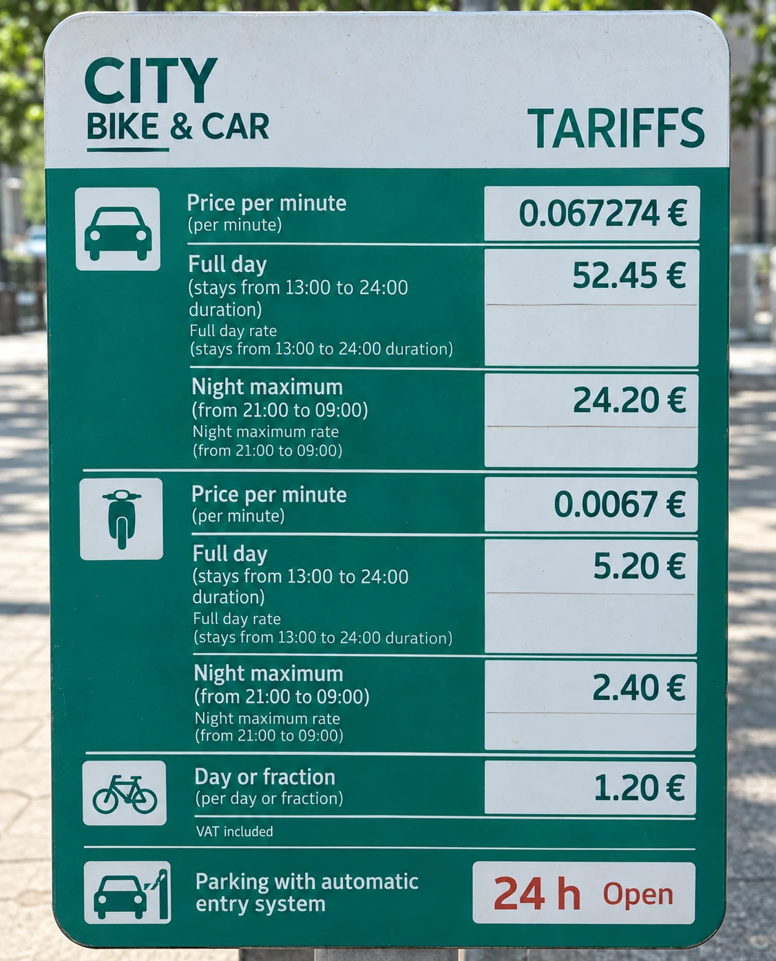
Everything I needed to calculate my parking cost was there. Nothing I needed to know was there.
I sat there doing arithmetic I hadn't planned on, while someone waited behind me, wanting to get past a barrier that was supposed to take three seconds to clear.
The Right Answer to the Wrong Question
€0.067274 per minute is not an imprecise number. It is not an inaccurate number. It is exactly correct — a faithful representation of what the parking costs, to six decimal places.
The problem is that it answers a question nobody standing at that barrier is actually asking.
Data and information are not the same thing. Data is technically correct. Information is data that answers a question someone actually has. €0.067274 per minute is data. "About €8 for two hours" is information, and that number was nowhere on the board. A number that serves the machine calculating the bill is not the same as a number that serves the person deciding whether to park. One is correct. Only one is useful.
Who Was This Actually Built For?
The board wasn't badly made. It was, in fact, exactly right: for an auditor checking that the posted tariffs match what the machine actually charges, or for whoever built the pricing engine and needed every rate documented. Per-minute rate, full-day rate, night cap: that is precisely the set of inputs a billing system needs, in exactly that order.
It is also exactly the wrong set of things to hand someone with three seconds, an engine idling, and no interest in the billing system's internal logic.
That gap is rarely the result of carelessness. Sometimes nobody consciously chose to put the billing system's needs above the driver's — it just happened that way. Sometimes the sign was designed for someone specific, an auditor, a regulator, and the person at the barrier was simply never in the room. And sometimes, if you look carefully, the design is working exactly as intended. Just not for you.
I've spent most of my career standing in that gap, first as a technologist, then working alongside the people who have to use what technologists build.
So I sat there a moment longer than I'd like to admit, engine idling, did the sum twice to be sure, and drove in. We had a lovely evening out as a family. But that tariff board kept nagging at me. So I scratched the itch: when we got home, I redesigned it. I don't claim this is the best design, just a better one.
The Same Numbers, Answering a Different Question
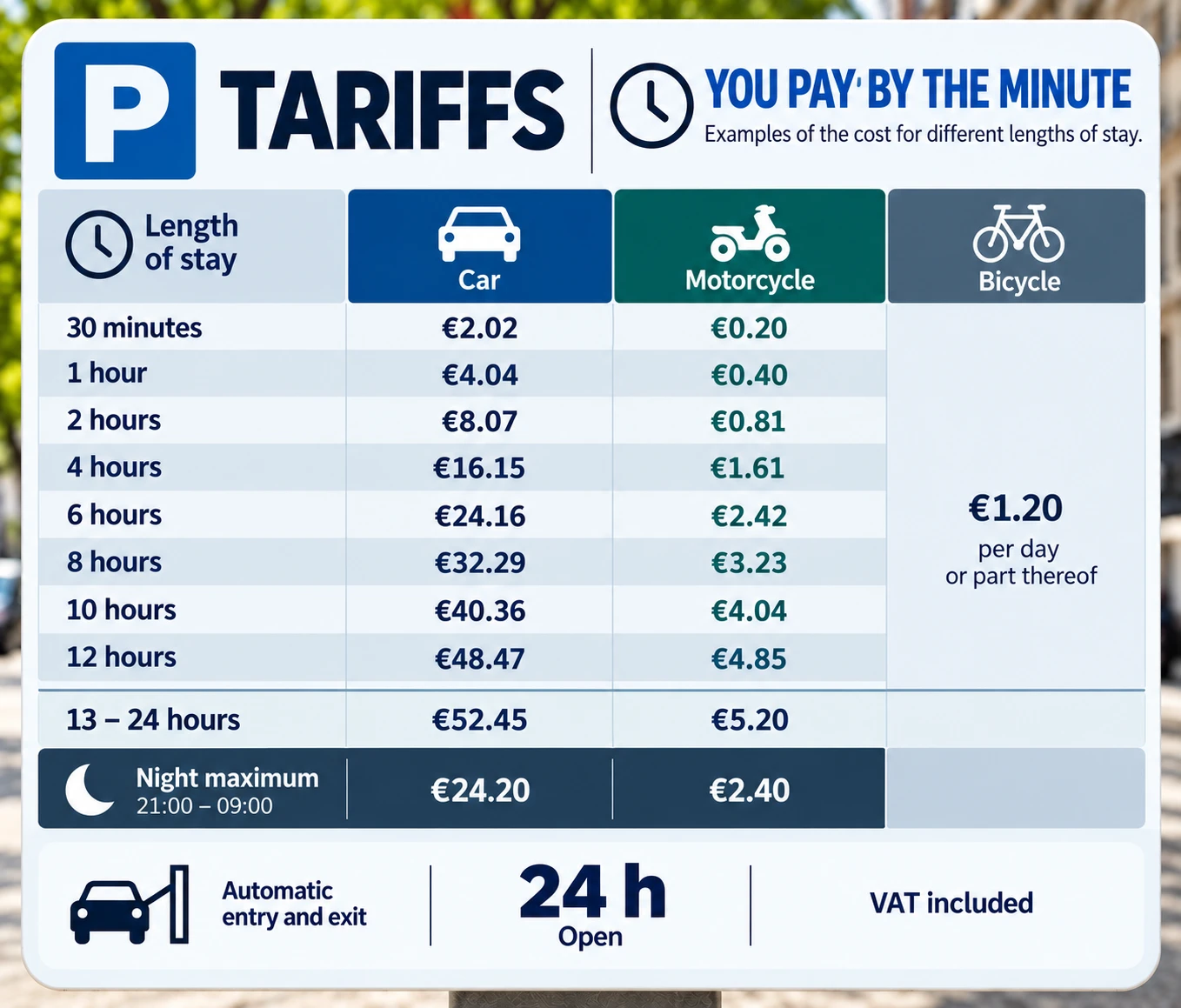
Same tariffs. Same operator, same building, same six-decimal price per minute buried in there somewhere if you go looking for it. But the board no longer asks you to calculate anything. It answers the only question you actually have standing at the entrance: if I stay this long, what will it cost?
30 minutes, 1 hour, 2 hours, 4, 6, 8, 10, 12 — read straight down the column for car, motorcycle, or bicycle, and the number is just there. The 13–24 hour rate and the night maximum sit exactly where they'd naturally come next, instead of off in a separate box competing for attention with the compliance language around them.
Nothing about the pricing changed. What changed is the direction of the work: the original made me build the answer from raw ingredients. The redesign hands me the answer directly, worked out in advance for the handful of situations that actually happen — a half hour, a lunch meeting, a full working day — rather than the infinite range a formula can technically produce.
Designed for a Machine, Used by a Human
A rate table is how a computer thinks about pricing: a formula, a few variables, apply as needed. A duration-to-cost table is how a person thinks about a decision: I have this much time, what will it cost me. Both describe the same pricing. Only one of them fits how a human being actually chooses in the three seconds available at a parking entrance, not by computing, but by scanning for the row that matches their situation.
The same failure shows up constantly in organisations. Take an OKR rollout: the framework lands as a glossary of definitions, objective, key result, confidence level, when the question people actually need answered is simpler: what do we stop doing? The definitions are correct. They just don't do the work the room needed them to do. Or a change programme explained through its workstreams and steering-committee structure, when what a team on Monday morning needs to know is: what is actually different for me this week? Or a leadership update with twelve KPIs, when the room came for one answer. In each case, the information isn't wrong. It has simply been organised around how it was produced, rather than around the decision someone actually needs to make with it.
A Question Worth Carrying With You
Next time you hand someone a document, a dashboard, or a sign — a policy, a report, a change plan, it's worth asking, plainly: did I organise this around what I know, or around what they need to decide?
Those are not the same question. And the gap between them is usually invisible to whoever built the thing, and completely obvious to whoever has to use it.